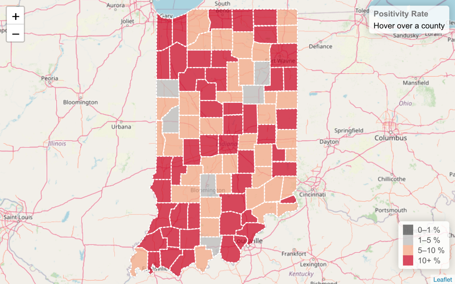
As an exercise in learning Leaflet.js, I created a choropleth map of the 14-day positivity rate of COVID-19 testing in Indiana counties. You can find all of the code on GitHub: https://github.com/machristie/covid-19-in-counties-positivity-rate.
Why Positivity Rate?
According to the John Hopkins Coronavirus Resource Center, the WHO recommends that governments not proceed with reopening until the positivity rate (that is, the percentage of COVID-19 tests that come back positive) stays at 5% or lower for at least 14 days. Positivity rate is a good tool for assessing readiness to reopen because it indicates whether COVID-19 testing is being done only for those who are already sick or whether it is being used to test a wide swath of individuals to find also asymptomatic cases and thus prevent the spread of the disease.
I decided to create a map of positivity rates in Indiana counties since I hadn’t yet seen a visualization of that data at the county level. For example, the John Hopkins Coronavirus Resource Center above graphs the positivity rate for Indiana as a whole, but not at the county level. However, many decisions about reopening are made at a county level, such as school corporations deciding whether to reopen. Thus it makes sense to look at the positivity rate also at the county level.
What’s a choropleth map?
A choropleth map is one in which each region on a map is colored based on the bucket in which a chosen data value falls. A simple and familiar example is a US presidential election map where each state that went to the Democratic candidate is colored blue and each state that went to the Republican candidate is colored red.
You need three things to create a choropleth map:
- Geospatial data for the regions of interest. Usually for each region you’ll need a list of latitude, longitude pairs that describe the polygon or set of polygons that circumscribe the region. In this case, I need the geospatial data for Indiana’s counties.
- Some data that will be used to distinguish the regions. I used the positivity rate as a discriminating factor, so I need data at the county level that will tell me the total number of COVID-19 tests and the number of positive tests.
- A color scheme to be applied to the regions. I’ll use an online tool, ColorBrewer, to general a color scheme that will highlight those counties that have > 5% positivity, since that’s the crucial cutoff in the WHO recommendation.
Getting Indiana county map data
GeoJSON seems to be the easiest geospatial file format to use with Leaflet.js so I searched for Indiana county map data in GeoJSON format. I found this site, operated by Eric Celeste, that has exactly what I need. I opted for the 20km resolution file, the lowest one, since I don’t need high-resolution data for my purposes.
Adding in the COVID-19 testing data
County level COVID-19 testing data for Indiana is available from the Indiana Data Hub. This dataset has the daily number of COVID-19 tests and the number of positive results for each county.
Each "feature" in a GeoJSON "FeatureCollection" has both a geometry and an arbitrary set of properties. I decided write a Python script that would process the 20km resolution counties GeoJSON file, filter out the non-Indiana counties, and then add the COVID-19 testing data to the properties of each county. I used Pandas’ read_excel to process and extract the testing data in Excel format and create dictionaries of the data that could be added to the properties.
Here’s the code to read the testing data from the Excel file:
def load_covid_19_data(covid_data_excel):
    covid = pd.read_excel(covid_data_excel)
    # Past 14 days starting from yesterday
    past_14_days = [(date.today() - timedelta(days=x)).isoformat() for x in range(1, 15)]
    covid = covid[covid["DATE"].isin(past_14_days)]
    covid_count = covid.pivot(index="LOCATION_ID", columns="DATE", values="COVID_COUNT").to_dict('index')
    covid_deaths = covid.pivot(index="LOCATION_ID", columns="DATE", values="COVID_DEATHS").to_dict('index')
    covid_test = covid.pivot(index="LOCATION_ID", columns="DATE", values="COVID_TEST").to_dict('index')
    return covid_count, covid_deaths, covid_test
And here the data is added to the properties of each feature:
    covid_count, covid_deaths, covid_test = load_covid_19_data(covid_data_response.content)
    for feature in counties_data["features"]:
        fips = int(feature["properties"]["STATE"]) * 1000 + int(feature["properties"]["COUNTY"])
        feature["properties"]["POP"] = pop_data[fips]["POP"]
        feature["properties"]["COVID_DEATHS"] = covid_deaths[fips]
        feature["properties"]["COVID_COUNT"] = covid_count[fips]
        feature["properties"]["COVID_TEST"] = covid_test[fips]
The fips is the FIPS county code, a standard code for each county in the US.
Applying a color scheme using ColorBrewer
For the color scheme I used the ColorBrewer tool. There are several different kinds of color schemes you can use for a choropleth:
- sequential – the data being visualized is a range of values, for example, population density
- diverging – the data diverges around a critical value, for example, an annual average temperature anomaly
- qualitative – for non-quantitative, categorical data, for example, coloring a map based on majority race or ethnicity
In this case, a diverging color scheme is the best fit. The critical value, based on the WHO recommendation I mentioned above, is the 5% positivity rate threshold. I chose a color scheme with two shades of red for above 5% (light red for 5-10%, dark red for 10+%) and two shades of grey for below 5% (light grey for 1-5%, dark grey for < 1%).
In Leaflet.js, when styling each county, the feature’s properties are used to compute the positivity rate and then the corresponding color is looked up for it.
      function getColor(positivity) {
        const index =
          positivity >= 0.1
            ? 0
            : positivity >= 0.05
            ? 1
            : positivity >= 0.01
            ? 2
            : 3;
        // https://colorbrewer2.org/#type=diverging&scheme=RdGy&n=4
        const colors = ["#ca0020", "#f4a582", "#bababa", "#404040"];
        return colors[index];
      }
      function style(feature) {
        return {
          weight: 2,
          opacity: 1,
          color: "white",
          dashArray: "3",
          fillOpacity: 0.7,
          fillColor: getColor(getPositivityRate(feature.properties)),
        };
      }
Resources
I made much use of a Leaflet tutorial on creating choropleth maps, which I encourage checking out if you want to learn more about this type of visualization.